WHO Knowledge Action Portal
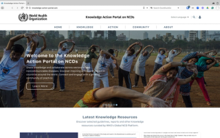
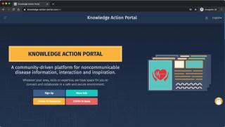
I helped the World Health Organization assess and develop an improvement roadmap for the Knowledge Action Portal (KAP), a community-driven communication and collaboration web application focused on the prevention of non-communicable diseases. Now, the KAP team has a clear path forward for making high-impact usability, accessibility, and performance improvements.
Project Activities
- Best practices usability review
- Accessibility audit
- Performance evaluation
- Messaging & design language review
- Findings synthesis & prioritized recommendations roadmap
Jack Fisher, Technical Officer World Health Organization“It was an absolute pleasure working with Andy as he provided us with an expert review of the web platform, with actionable next steps and clear guidance throughout. He is a very strong communicator with expert knowledge and background in the area. We really appreciated the hands-on detailed approach throughout and he was very adaptive to our timelines and requests. We would have no reservations in using Andy for future projects or recommending him to other colleagues or peers.”
Project Goal
Deliver the "Unvarnished Truth" About Web App Usability
In 2018, the World Health Organization launched a community-driven communication and collaboration platform called The Knowledge Action Portal (KAP). The goal of the KAP is to connect and engage WHO Member States, UN Agencies, and non-State actors working on the prevention of non-communicable diseases like diabetes, cancer, and cardiovascular disease. Because the KAP was assembled piecemeal over the course of two years, however, it behaved more like a collection of parts than a coherent, purposeful system. This makes the KAP laborious and difficult to use.
Project Approach
Evaluate and Synthesize for a 360° View
Because the KAP’s usability, accessibility, and performance issues are all interrelated—and are all interconnected pieces of why the system as a whole is hard to use—it was necessary to examine each aspect of the site in detail, then synthesize all of those details into a comprehensive, actionable whole.
To accomplish this, the project included a series of clearly defined and results-oriented activities, including:
- Review existing research and interview key stakeholders to ensure that subsequent evaluations aligned with WHO and KAP user goals, and took into account known issues and ongoing work.
- Assess the overall user experience of the KAP using a multifaceted assessment focused on usability, accessibility, performance, and messaging and design language.
- Identify high impact accessibility issues that are preventing users with visual, motor, or neurological disabilities from accessing KAP resources
- Identify web performance and infrastructure issues that are preventing those with low bandwidth or processor resources from using the KAP effectively
- Deliver a frank account of the “unvarnished truth” about the KAP website, supported with the evidence, industry practices, and examples that will allow the KAP team to understand, communicate, and act on these findings
- Deliver a prioritized set of recommendations that provides KAP designers and developers with an actionable roadmap for rolling out high impact improvements to the site
Project Outcome
A Comprehensive View of App Defects—and How to Fix Them
The KAP team knew that the ad hoc construction of their web application had made it hard to use—and they knew what some of their users were complaining about—but they had no idea where to start in fixing it. By looking at the platform through multiple lenses and then synthesizing them into a 360° point of view, the KAP team can now confidently begin addressing problems without having to second guess if they’re starting in the wrong place—or just making things worse.
The KAP UX Audit final recommendation includes:
- An actionable list of 12 recommendations prioritized for the site as a whole, with 46 specific examples of where the recommendations apply across the site
- Detailed findings and recommendations for each evaluative lens assessed (usability, accessibility, performance, and messaging)
- Method and process documentation to support continued evaluation and decision making
- A one-page Executive Summary for sharing findings and recommendations with a wide range of audiences
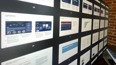
- A complete corpus of 70 ledger-sized pages of examples, annotations, findings, and recommendations drawn from analysis of the KAP
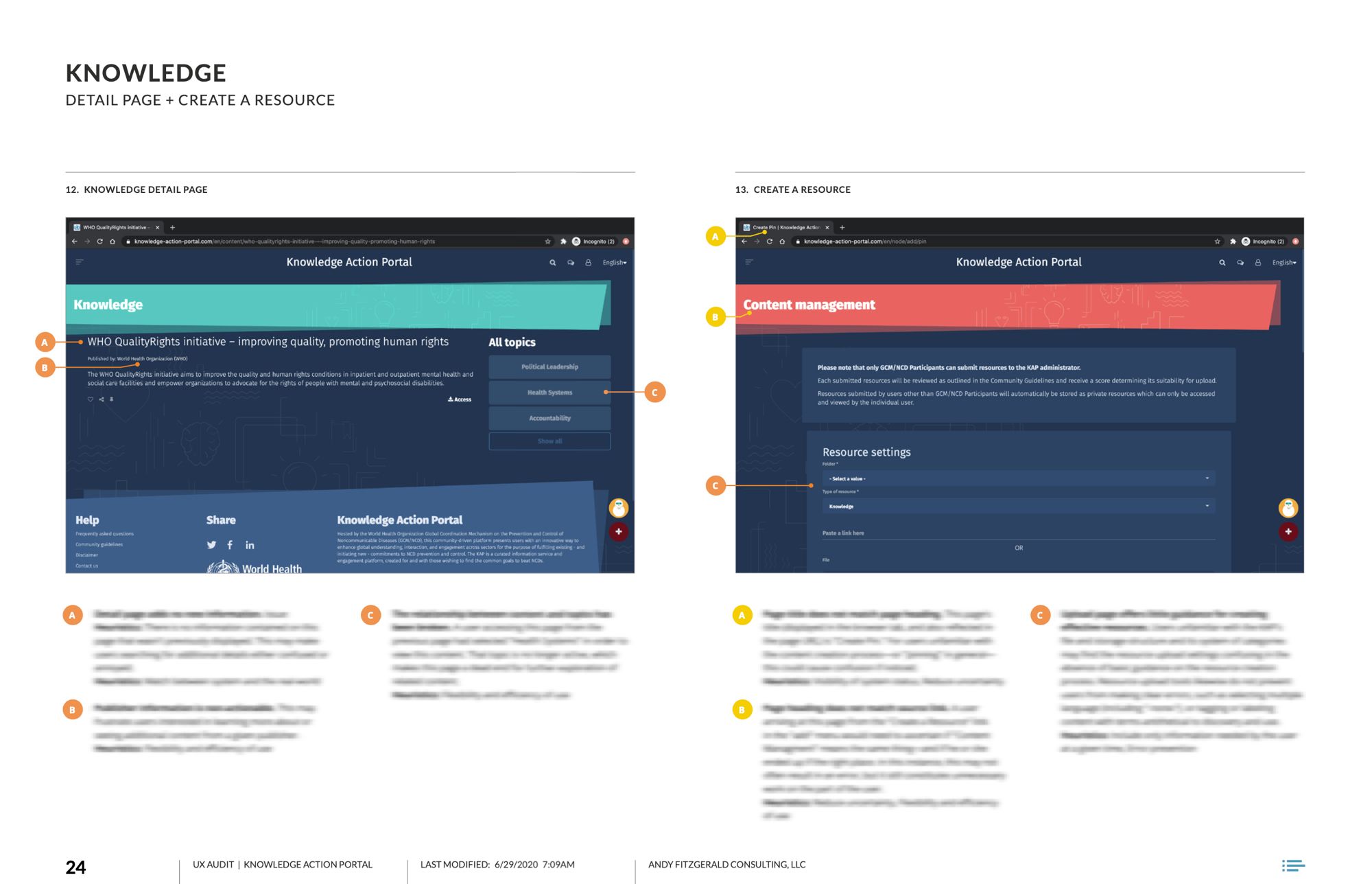
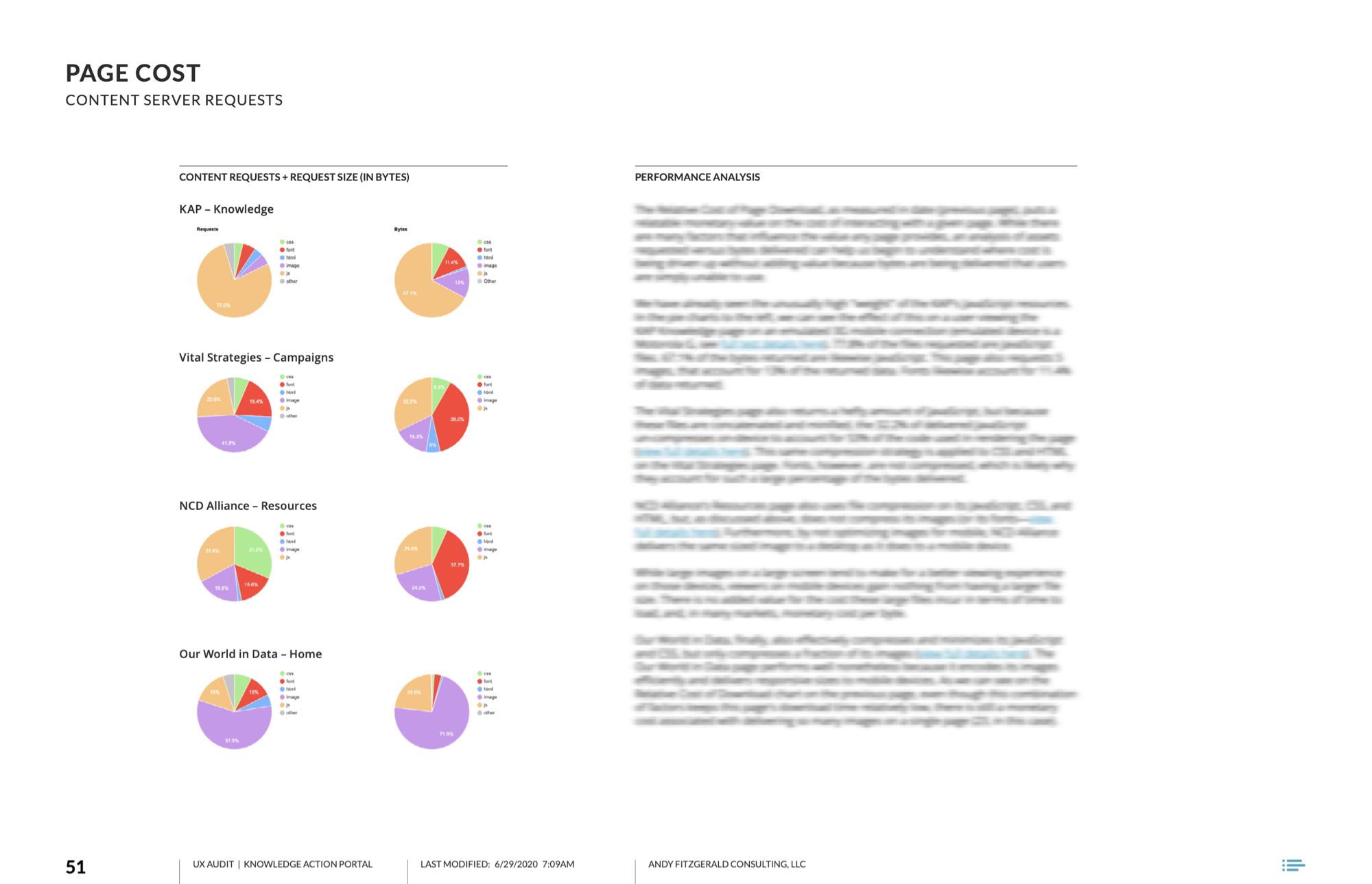
With the focused, prioritized insights provided by this assessment and roadmap, the KAP team was able to advocate for necessary changes and efficiently address the usability, accessibility, and performance reviews that had been making the Knowledge Action Portal hard to use. The updated tool supports an experience that is consistent with the expectations and goals of KAP stakeholders and users.
