Seattle Children's Hospital
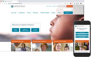
I helped Seattle Children's redesign their website's global navigation and home page to better meet the needs of their users, the requirements of their content, and the goals of their business. Now, their site more usable, more welcoming, and more clearly aligned with user and organizational priorities.

Project Activities
- Stakeholder interviews
- Alignment persona workshop
- Heuristic review
- Competitive analysis
- Card sort study
- Prototype usability testing for desktop and mobile
- Experience design specification
- Close collaboration with visual design and IT partners
Vanessa Casavant, Senior Digital Content Strategist Seattle Children's“Partnering with Andy on work for Seattle Children’s has been nothing short of a fantastic experience. He brings a perfect blend of analysis and design to his projects, along with great presentation skills in explaining concepts large and small to stakeholders.
“Andy is quite frankly the dream contractor you hope to have on a project. Not only by being on time and on budget, but also in finding the perfect balance for meshing business objectives with end-user needs and communicating with both developers and designers. I would definitely work with him again in a heartbeat.”
Project Goal
Align Navigation and Home Page with User and Business Needs
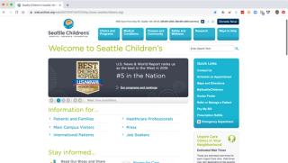
Seattle Children’s provides pediatric and adolescent care for patients across Washington, Alaska, Montana, and Idaho and is recognized as one of the 10 best children’s hospitals in the country. The Seattle Children’s website navigation and home page, however, had not been systematically redesigned since their creation in 2009. As a result, the site's global navigation was no longer effective for users increasingly accessing the site on mobile, and the home page was meeting neither user nor business needs.
Project Approach
Needs-Based Design Supported by Research and Testing
In order to ensure that design recommendations met both user and organizational requirements, I worked closely with the Seattle Children’s marketing and communications team and actively involved both site users and stakeholders throughout the discovery and design process. This allowed us to understand user wants and needs, both on and beyond the website, and to tailor the presentation and access to content to align with user and organization goals.
Project activities included:
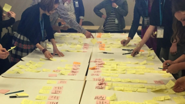
- Facilitate an alignment personas workshop, which engaged stakeholders in a collaborative process of externalizing and articulating their deep knowledge about the organization, its customers, and their goals.
- Perform a heuristic review and competitive analysis to help us reframe the site in terms of what's possible, as opposed to merely iterating on its current state.
- Conduct a card sort study with over 300 participants across three counties, in order to better understand site users’ mental models of Seattle Children’s content
- Develop a wireframe prototype and conduct a series of eight usability tests across two locations to gather direct end-user feedback on both desktop and mobile experiences.
- Develop a comprehensive experience design specification for desktop and mobile, and closely collaborate with visual design partners and Seattle Childrens' IT team to support development and launch.
Project Outcome
A Dynamic Focus on Action and Impact
In order to best accommodate Seattle Childrens’ approval workflows and development process needs, final design specifications were delivered in the form of annotated wireframe decks. A revised interactive version of the test prototype was also provided to provide further clarity into key interaction, screen flow, and motion elements.
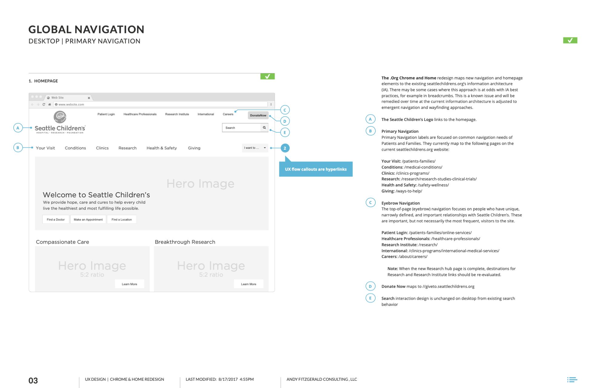
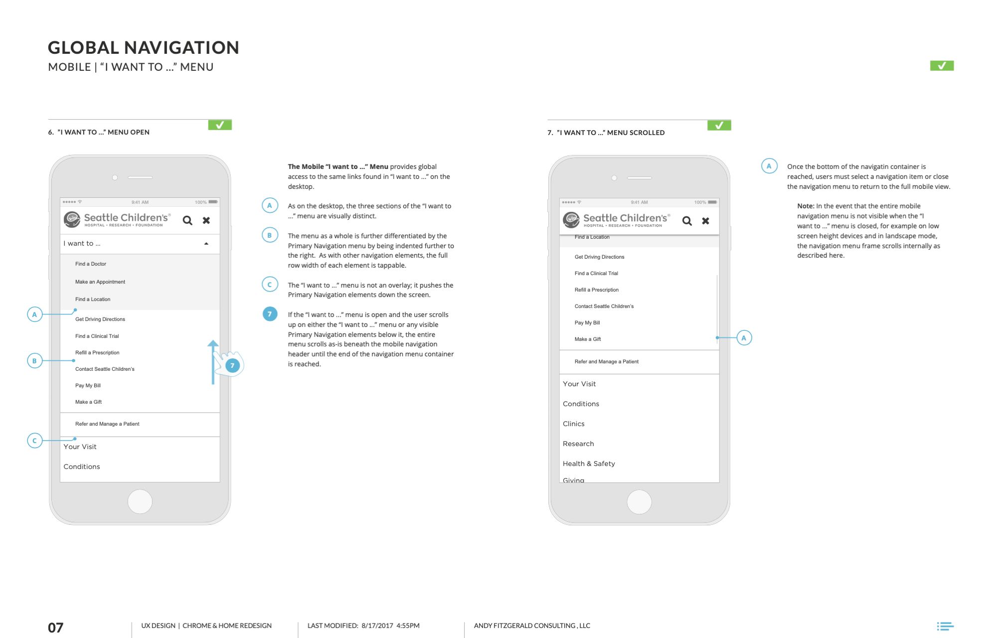
The new Seattle Children’s website represents a fundamental shift in the way Seattle Children’s communicates to site visitors. Where the old site focused on providing static information about the organization, the new site focuses on taking action (for example as a parent seeking care for a child or as a donor), and on demonstrating the impact Seattle Children’s has on the community.
This shift was accomplished by balancing user and organizational priorities for the website and by using a research-driven, user-centered design approach to align Seattle Childrens’ multiple interests around their shared organizational goal: to help every child live the healthiest and most fulfilling life possible.
