Structured Content Design Workflow 2022
Structured content design is the process of designing digital resources (like websites and apps) from the content out, as opposed to creating page or screen templates first—then shoehorning content into them right before (or right after) launch. This article will introduce you to a repeatable structured content design process, provide an example of that process in action, discuss how each step scales to different sized projects, and leave you with a set of resources you can use to get started with structured content design.
Since I first wrote about Structured Content Design in 2019, I’ve had the good fortune to be able to practice, hone, and evolve this approach with clients. This update for 2022 includes revisions based on what I’ve learned in that time, as well as ways I’ve adapted the approach to better suit the changing role of structured content in modern digital systems.
A structured content approach to digital work has a number of advantages over typical “interface first” processes:
- Website and app designs are optimized for their actual content
- Content is created and stored in a way that allows it to be reviewed, displayed, mixed, and remixed across platforms
- Structured content works hand in hand with component driven architectures that prioritize user preference, personalization, and adaptability
- Content as data is machine actionable, which makes it better prepared for emerging platforms like voice and AI-mediated experiences (like Siri, Alexa, and Google Home), and facilitates the integration of natural language processing (NLP) and knowledge graph technologies
More than any individual benefit, however, structured content focuses on communicating effectively to an organization’s patrons, constituents, and customers, wherever and however they choose to access content. While it is the cornerstone of effective, scalable content design for the web, structured content design is much more than a “web” technique: it is a way to prioritize effective communication across contexts.
The Project
In order to illustrate this workflow in practice, I’ll present the steps I use to design structured content in the context of a recent redesign I conducted for the website uxmethods.org. The original UX Methods project, created in the beginning of 2021, was a proof of concept (POC) for a knowledge graph driven education resource. Its goal was to help those new to the practice of user experience design explore and understand the purpose-driven connections between UX tools, techniques, and approaches.
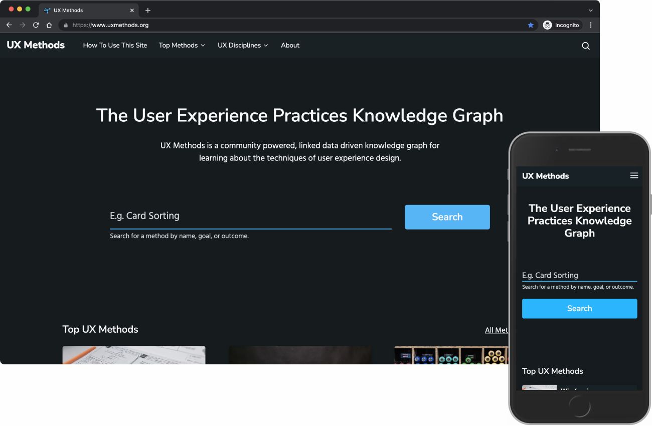
While the POC did prove out the viability of using a knowledge graph to infer relationships and hierarchy in a traditional web context, it also demonstrated several critical shortcomings in the original approach:
- The overall structure was of a subject, not for a user-centered purpose
- The process of adding and updating content involved too many manual steps
- The site’s structure, though built into the content at a fundamental level, was too dependent on site contributors remembering and following rules
- The site’s interdependent components were too rigidly coupled, resulting in cascading failures in the case of errors
In late 2021, I used a structured content design approach to remedy these problems and rebuild UX Methods in a more sustainable, growth-oriented, and user-focused way.
The Process
At a high level, a structured content design workflow moves through four interconnected phases: Meaning, Structure, Expression, and Maturation. Each phase focuses on particular activities and outputs, each of which influence the other phases in both linear and non-linear ways.
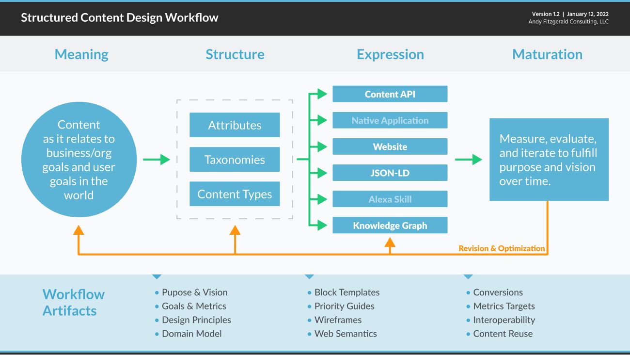
- Meaning uses research data and stakeholder insight to understand structure and content resources relative to organization goals and user needs.
- Structure defines and maps content resource types and attributes to support clearly defined, goal-oriented organization and user activity.
- Expression creates platform-specific modes of access to content resources and functionality in order to meet organization and user goals in context.
- Maturation frames the tooling and mindset necessary to measure, evaluate, and iterate meaning, structure, and expression in order to fulfill purpose and vision over time.
Meaning
Use research data to understand structure and content resources relative to organizational goals and user needs.
Work in the Meaning phase begins with a foundation of design research. This often includes:
- stakeholder and user interviews
- content analysis
- traffic, behavior, and keyword analysis
- website and web app user feedback review
- competitive analysis with comparable organizations and products
As the motivation for the UX Methods project is born out of my personal experience teaching and practicing user experience design, much of my initial discovery was drawn from feedback provided by students and colleagues. The POC site provided a source of traffic, behavior, and keyword data, as well as an initial corpus of content to audit and evaluate for migration. As part of the redesign process, I also completed a competitive audit of comparable sites to better understand how a resource like UX Methods would fit with similar resources already widely in use.
From these inputs, I drafted a vision statement for the redesigned site, identified site goals and high level metrics with which to track progress toward those goals, and created an actionable set of principles to guide design efforts moving forward.
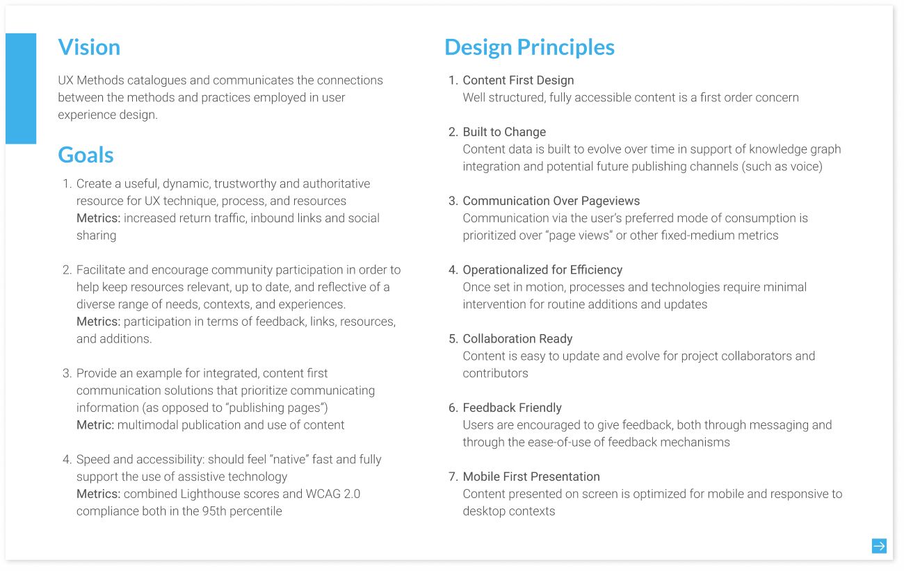
Once these foundational goals and the principles were clear, I created a domain model. In this context a “domain” is “a sphere of knowledge, influence, or activity” (Atherton & Hane, 33), or, more technically, “the particular context of application for the organizing system being designed and the kinds of interactions with resources it will enable” (Glushko, 319). A domain model helps create clarity around concepts, terms, and relationships important to the content being organized. For client projects, the process of domain modeling also helps create alignment and identify gaps in knowledge and conflicting points of view among stakeholders.
The domain modeling process consists of two equally important steps: identifying and defining the core concepts in the subject domain in question, and then mapping the principal relationships between those concepts.
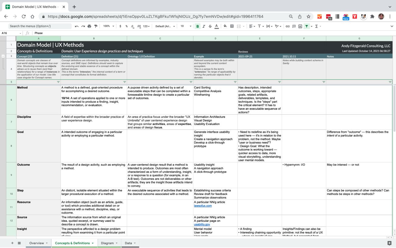
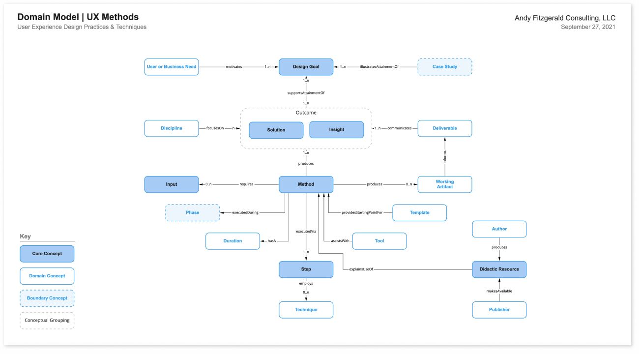
👉 Read more about the details and steps of domain modeling in Domain Modeling for Structured Content.
Once you’ve identified the relevant concepts and their relationships, you can then identify which ones are the most likely content types: the concepts around which reusable structures for common resources across the subject domain should be built. Identifying content types provides a starting point for the content modeling that happens in the next phase, Structure.
How Does it Scale?
The Meaning phase focuses on creating an explicit, common understanding and alignment on an organization’s goals, content, and value proposition. Since UX Methods is a personal project, this example doesn’t include the usual cast of stakeholders and teammates that would normally participate in this step. For client projects, however, activities in the Meaning phase are deeply collaborative and deeply iterative. The framing of principles and goals are golden opportunities to have rich, meaningful conversations early on in project work. Meaning tasks can also help to inform and nuance other common discovery phase work, such as persona creation and existing research review and synthesis.
The process of domain modeling is likewise iterative and collaborative. I typically take a first pass at a list of domain concepts and definitions based on my initial research, then conduct a series of reviews with stakeholders and subject matter experts (SMEs) to revise and refine the set. I use the same process for modeling a visual representation of the domain: I typically create three or four candidate models, then review and refine them with stakeholders and SMEs. Creating an initial domain model can also be a good collaborative group exercise.
Structure
Define and map content resource types and attributes to support clearly defined, goal-oriented activity of organizations and users.
Inputs from the Meaning phase provide the raw material from which to define structure. This foundation provides an informed basis from which to:
- define content types
- identify the attributes they share
- frame the taxonomic relationships that link them together within the identified subject domain
Work in the Structure phase uses the domain model and domain insight created in the Meaning phase to create a content model that details, organizes, and maps content types and relationships. At a high level, the content model can be represented as a simple table that describes the repeatable types that make up the model.
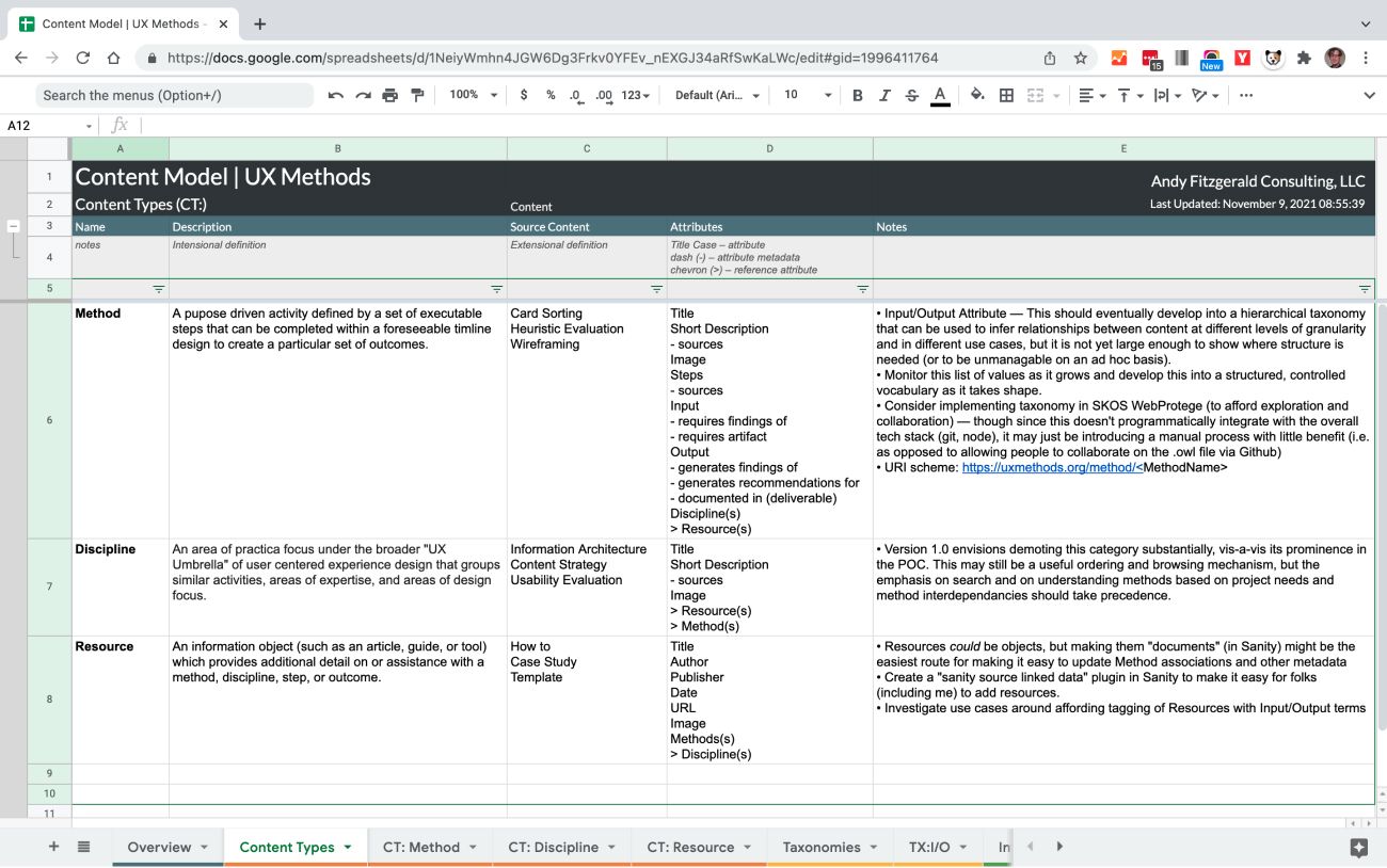
Below this simple surface, however, types, attributes, and taxonomies are worked out in detail. These elements provide the connective tissue that holds the structure together and allows it to be articulated effectively across contexts. Content type specifications are where the structure of content as data is rigorously described.
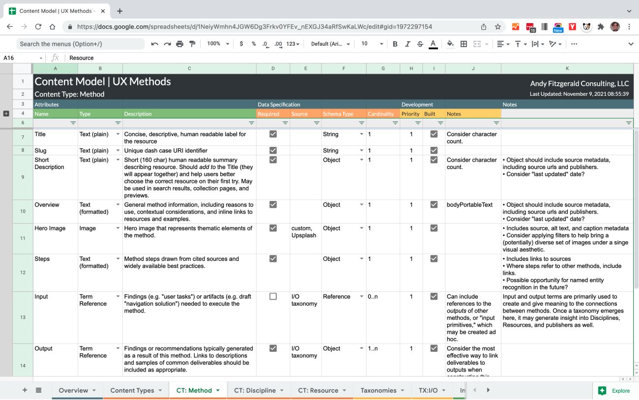
Content types are informed by the concepts defined in the Meaning phase and by the relationships uncovered in the domain model. This context helps you decide which elements should be represented as individual attributes, and which datatype should be employed to represent those attributes.
While some attributes will call for “primitive” values—a string, like a name or short description, a number, or a true/false (Boolean) value—others may refer to other entities or taxonomy terms. Drafting taxonomy terms and relationships in the Structure phase can give you a good sense of the level of complexity you’ll need to be able to support to describe and interconnect structural elements.
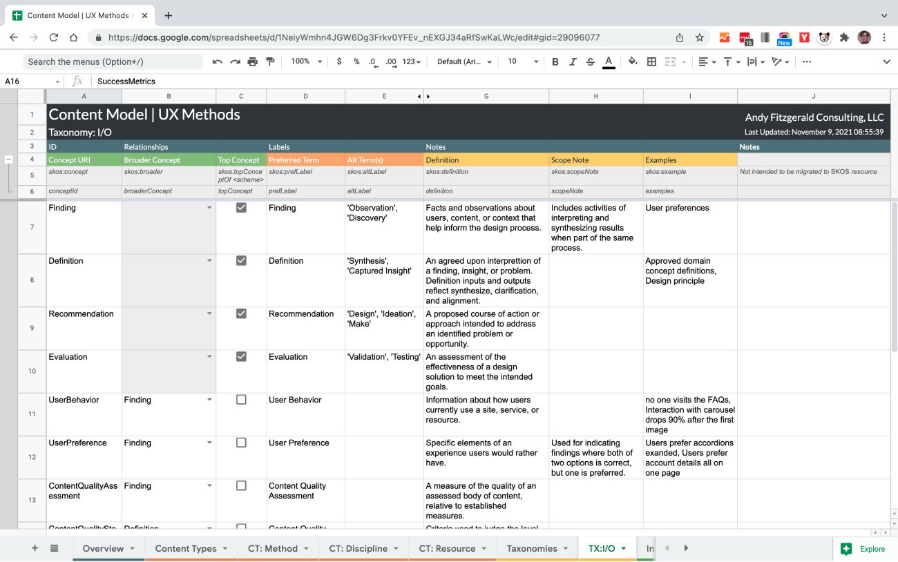
For UX Methods, I created a custom Input/Output taxonomy that provides the semantic connections for making related content recommendations. This taxonomy started off with just 22 terms at two levels, but ideally will grow as the project evolves to scores, if not hundreds of terms. By defining this taxonomy in a standards-compliant way from the start, in this case using the W3C recommended SKOS data model, growth potential and interoperability are built in at a foundational level.
How Does it Scale?
The number of content types needed by a given collection depends largely on the scope of its domain, but the process for delineating and describing content models scales proportionally to larger projects. By properly structuring inventory, audit, and content model data, even large content sets and complex models can be analyzed and structured using commonly available, easily accessible tools.
I like to start this process with platform agnostic applications (hence all the spreadsheets) because this helps the content design team focus on the inherent structure of concepts, as opposed to adapting from the start to the varying strengths and weaknesses of specialized software. For all but the smallest organization systems, taxonomies and content types will eventually be managed by a CMS or standalone vocabulary management tool. Starting with a simple representation of structured content makes it easier to export these design foundations in formats specialized tools can import and use, such as CSV or JSON files.
Expression
Create platform-specific modes of access to content resources and functionality in order to meet organization and user goals in context.
The structure defined in the previous phase provides a foundation for communicating the meaning we defined in the first phase. Since this structure isn’t dependent on a specific platform or technology, it can be used as a starting point from which to express content across any number of contexts.
For UX Methods, the connective tissue between Structure and Expression is a headless CMS. In this case, I built the content model defined above with Sanity.io, which offers a content API that is fully decoupled from the front end. Decoupling content from presentation means I can frame the content editing experience in terms of what the content needs to communicate, as opposed to “how it looks.”
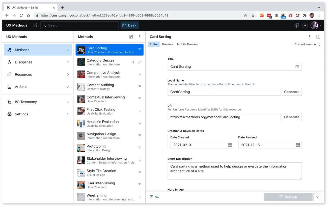
With a content API in place, the next step is to express this content on the web. For many stakeholders (and practitioners), this will be the first phase that “looks like design.” While it is the first place we begin to sketch out traditional user interfaces, these interfaces are not “the start of design”: they are an articulation of the meaning and structure we’ve already established.
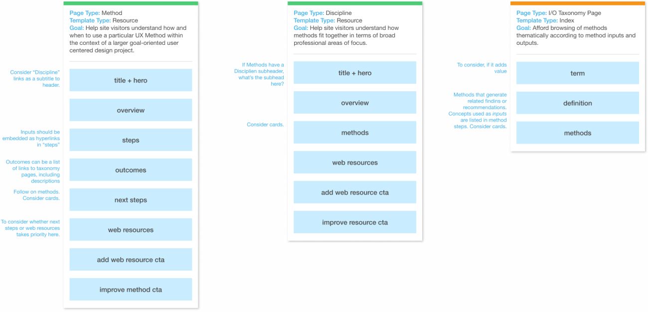
In the case of UX Methods, the most explicit way to move from “content model” to “web user interface” is to use content type attributes, as defined in the content model, to construct block templates, and then use those these block templates to create priority guides.
A block template is a simple, prioritized list of the content attributes that will appear in each page type. For UX Methods, I created a block template for each distinct resource page (Method and Discipline) and an index page for taxonomy term listings. Resource page templates mostly contain attributes from a single content type, with selected related content attributes as defined in the content model added in. The index page template presents thematic collections of key attributes across content types to allow users to discover related resources across the site.
Priority Guides are minimal, content-driven representations of page level content. As Heleen van Nues and Lennart Overkamp put it, “a priority guide contains content and elements for a mobile screen, sorted by hierarchy from top to bottom and without layout specifications. The hierarchy is based on relevance to users, with the content most critical to satisfying user needs and supporting user (and company) goals higher up.”
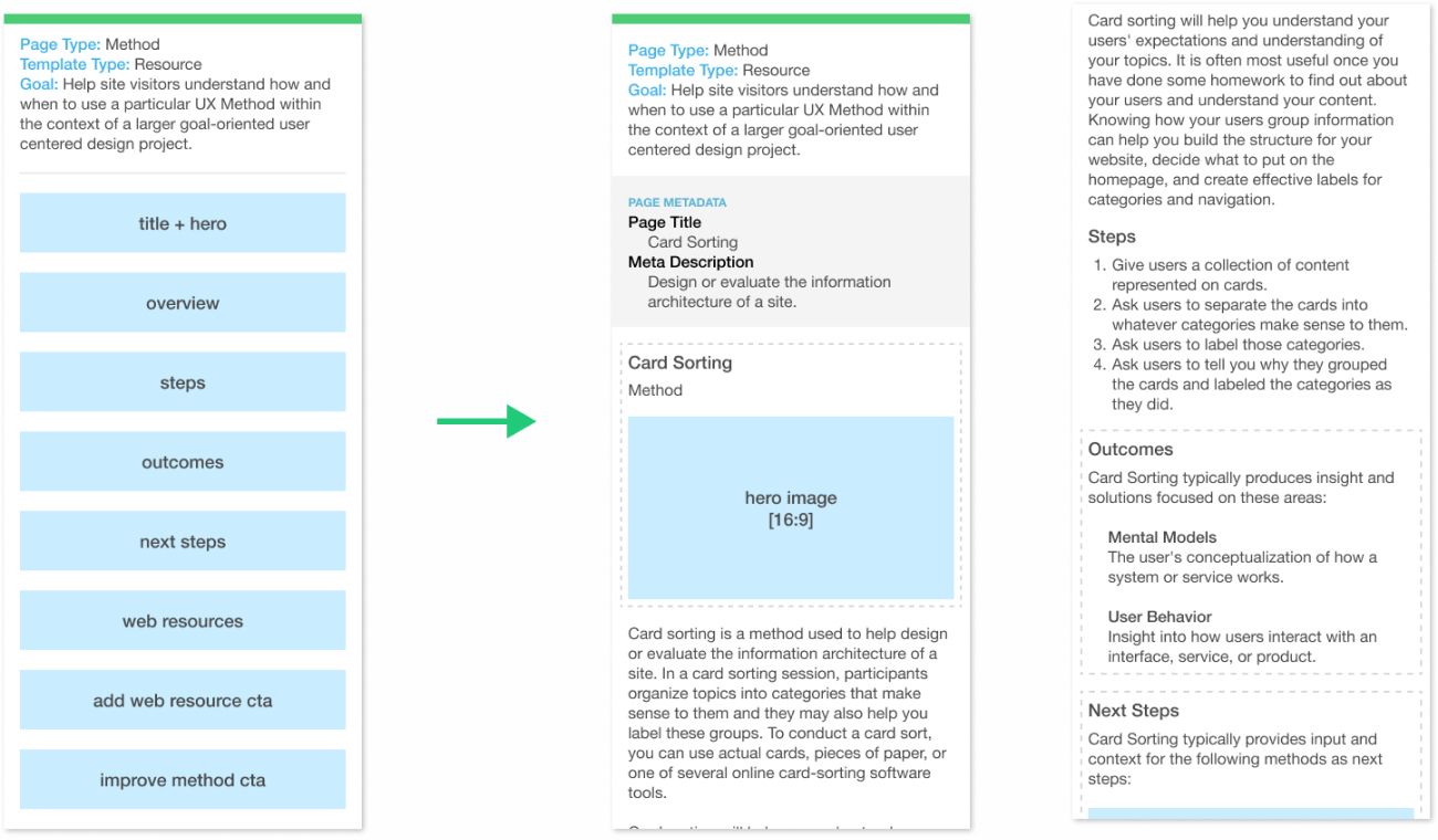
Mapping attribute contents and priorities in block templates helps verify early on in the design process that the system for expressing content works globally, and that resources are connected in ways that express and are supported by the structure you’ve defined. Once you’re confident this big picture view supports project goals, you can then “expand” your block templates into priority guides, using actual, prioritized content as the foundation of the interface design process.
Because they emerge from the inherent structural connections of domain content, priority guides create an implicit sense of how the content collection “hangs together” by itself. Related content, shared attributes, and shared taxonomy terms all work to create a sense of “aboutness” and interconnection.
Global navigation subsequently makes these connections explicit, and layers in additional opportunities for meaning-making and discovery that go beyond what individual resources can offer at the page level. Moving from priority guides into wireframes is generally a good time to begin layering in global navigation elements. Most modern design tools like Figma and Sketch likewise make it easy to begin testing navigation ideas at this stage with easily assembled clickable prototypes.
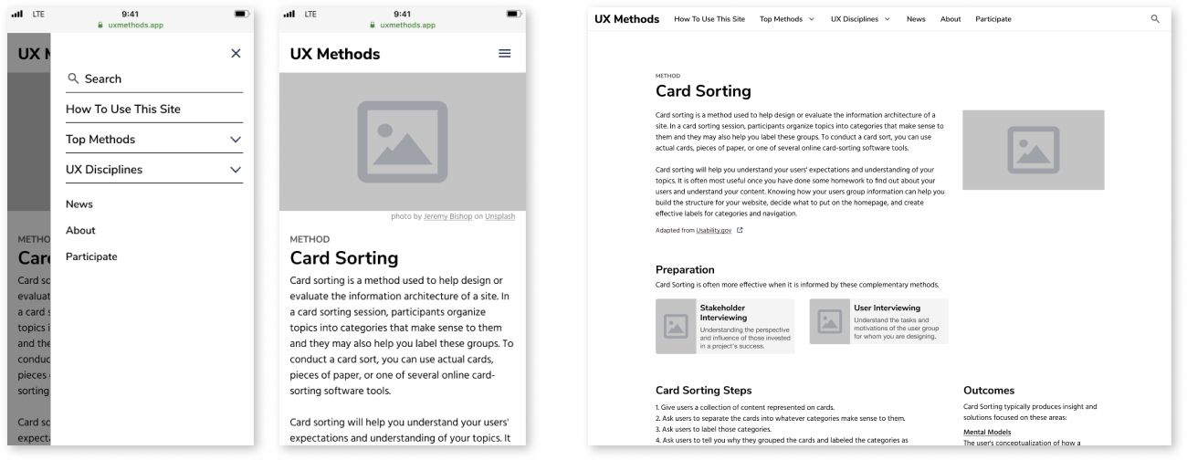
Clients and colleagues are sometimes surprised that the creation of global navigation occurs this late in the design process. Once we recognize that the primary “connectedness” of the content is embodied in the content itself, however, this order makes perfect sense. It also means that you can design navigation that supports these inherent connections, instead of mandating an arbitrary structure and forcing content to fit into it.
For UX Methods, the visual design was carried over in its entirety from the POC, so moving from wires to page templates in the new build was mostly a question of making sure the HTML was semantically correct and the appropriate CSS was applied.
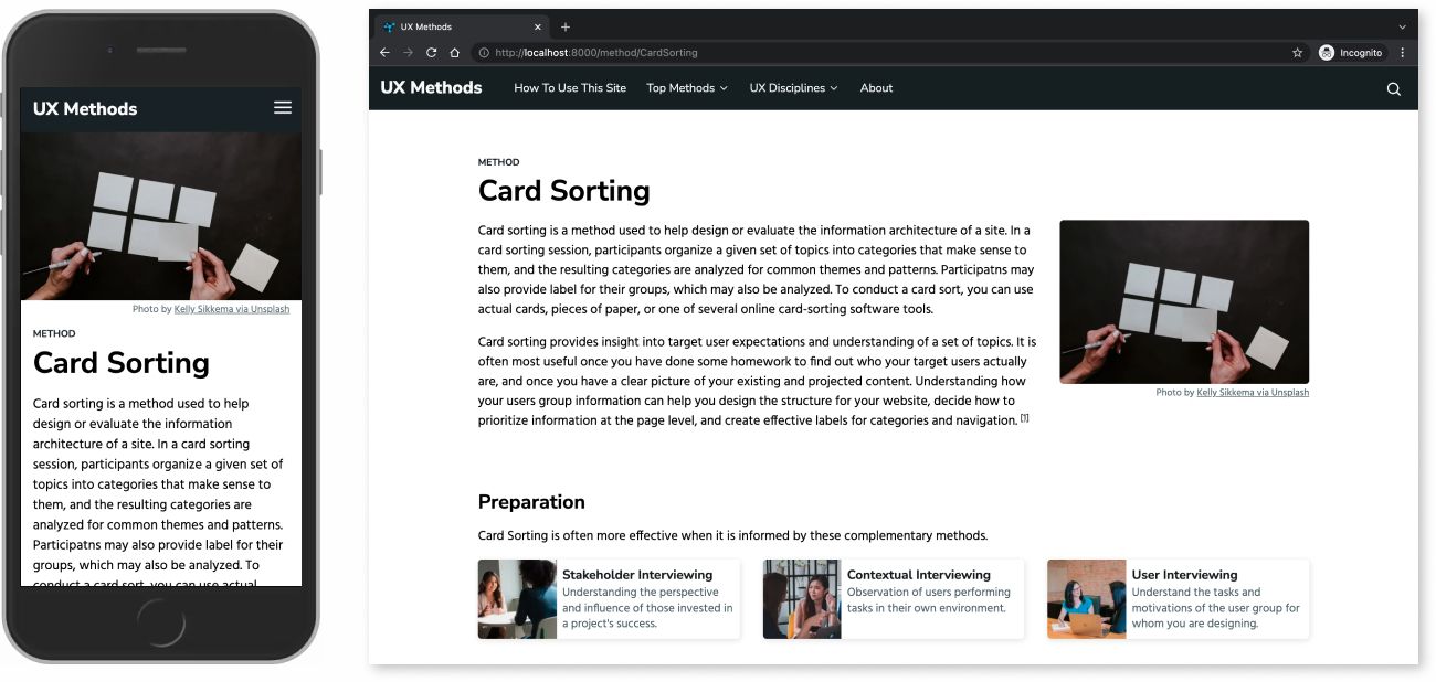
“Pages,” however, aren’t the only way content might be expressed on the web. For UX Methods, in addition to screens, Linked Data was added to the <head> element of each resource so that search algorithms and digital agents (like Google’s rich results or smart home voice assistants) also have first class access to the content. Method content is also transformed into RDF, which encodes data for use on the Semantic Web, and loaded into a lightweight knowledge graph hosted at Data.world.
The addition of expression as RDF makes UX Methods content reusable and interoperable with other semantic web applications. It also introduces a graph database endpoint that can be used to query the UX Methods knowledge graph for inferred insights. These insights are used, for example, in selecting and prioritizing “Top Methods” content, and in keeping “preparation” and “next steps” content in sync and up to date. Because both Linked Data and RDF are drawn from the same content source and use automated workflows, neither of these additional modes of expressing content create additional work for content creators.
👉 Read more about the integration of structured content and knowledge graphs in Boutique Knowledge Graphs: Creating Smart Content at Any Scale.
How Does it Scale?
Expression is where scaling can differ widely from project to project, and from platform to platform. To express a content set on the web, a small site might need a small team or just one person, as is the case for UX Methods. For a recent county government client with thousands of pages, on the other hand, my team split up the website IA, interaction design, visual design, content migration, and development between a dozen individual contributors.
As with other steps in this process, Expression will often require additional tools from the UX skill set. User flows and use cases, prototyping and usability testing, tree testing, and other iterative and evaluative methods are all potentially on the table. The steps described here are not intended to supplant user centered design best practices, but rather to integrate with them to bring structured content into workflows early and use it as an asset in the design process.
Maturation
Measure, evaluate, and iterate meaning, structure, and expression in order to fulfill purpose and vision over time.
The goal setting and metrics definition done in the Meaning phase of a structured content design approach provide the core elements for setting up a long term plan for the evolution and continued success of a content collection. I used to think of this phase as “optimization” or “performance evaluation,” but I’ve found that these terms can focus too narrowly on how well a particular tool works, for example a CMS or a front end, often at the expense of obscuring how well that tool works for the system as a whole at any given point in time.
For UX Methods, a key strategy for ensuring that its “system as a whole” can mature over time is its microservices architecture. Each of the elements that make up an expression of the content a user might interact with are “loosely coupled” with open, standards-based technologies:
- Content API: Sanity, Portable Text
- Open data communication standards: GraphQL, RDF, SPARQL
- Component-based front end: React, Gatsby
- Serverless functions: GitHub Actions, Webhooks, Javascript
By not relying heavily on one technology, service, or tool, the redesigned approach creates a more resilient system open to change. Each of these tools were chosen for its ability to represent a structure needed to communicate an intended meaning in a given context. Because the connections between them are loose, the system as a whole can be altered without causing the whole to crumble.
How Does it Scale?
Just as with each phase in this workflow, the Maturation phase is rooted in the goal of communicating effectively across contexts. Since the goals, content, and contexts of projects are bound to differ wildly, the steps taken to evolve a particular effort are likewise bound to be highly variable—and perhaps not easily anticipated from the outset.
By keeping these larger goals at the forefront of technology, monitoring, and performance optimization decisions, content designers can help business stakeholders define and support a clear vision of what their content needs to achieve—and avoid getting mired in blind allegiance to a particular platform or technology.
Outcomes
To a casual observer, the difference between the before and after of the UX Methods redesign should be largely unremarkable. Since neither the overall app nor visual design were issues with the site to begin with, this is as it should be.
The structure and expression used to communicate the site’s meaning, however, are completely reimagined and rebuilt. Each of these are now framed to support sustainable, incremental maturation over time. To revisit the set of shortcomings of the POC listed earlier:
- Content and site semantics are now focused on user outcomes as defined in the project vision statement. This meant scaling back the degree to which the field of user experience was documented, and focusing on the elements that will help users connect methods in practice. UX “disciplines” are still listed, but they are no longer elevated in site and page level navigation, or in the underlying knowledge graph that drives recommendations. Related resources, next steps, and visual wayfinding are prioritized.
- Publication of content, related resources, and knowledge graph data is now completely automated. Whereas the POC required a manual build and push process to update content and its underlying semantics, the revised version automates all of these processes in loosely coupled serverless functions. Because each element of the system is connected with open, standards-based protocols, altering or adding to automation workflows is not constrained by a single service or bottleneck, as is often the case in tightly coupled systems.
- Creating well structured content is now the path of least resistance. The UX Methods POC—like many client projects I’ve been called in to help with—depended too heavily on content creators remembering steps and making the correct decisions when authoring content. Even with the best intentions, this inevitably leads to errors. Adopting a decoupled, customizable CMS (Sanity, in this case) has made it possible to capture the correct level of structure for the effective expression of content across contexts.
- Loosely coupled microservices are built for resilience and evolution. The new version of UX Methods is still missing some key elements related to its primary goals, particularly when it comes to inviting participation and feedback. The new site’s microservices architecture and component-base design mean that work to layer these elements in can be done in parallel with regular content contribution (as opposed to grinding the whole thing to a halt while changes are being rolled out).
Resources and Getting Started
For reference and as a guide to help those who would like to dig deeper into these concepts, here is a summary of the sources I’ve referenced above, plus a few more that have indirectly influenced how I think about and practice structured content design:
- Designing Connected Content, Carrie Hane and Mike Atherton
- The Discipline of Organizing, Robert J. Glushko (Editor)
- Content Everywhere, Sara Wachter-Boettcher
- Content Strategy for Mobile, Karen McGrane
- The Elements of Content Strategy, Erin Kissane
- Content Strategy for the Web, Kristina Halvorson and Melissa Rach
- “Content Modelling: A Master Skill,” Rachel Lovinger
- “Priority Guides: A Content-First Alternative to Wireframes,” Heleen van Nues and Lennart Overkamp
Here is a list of the tools I’ve used on this project. Your tool set should of course be based on your project needs—and there are a lot of good options out there—but these have worked well for me:
This approach and case study reflects the insight and advice of dozens of colleagues and innovators, as well as my own threading together and evolution of these techniques. I’ve endeavored to give appropriate credit wherever it is due above. If I’ve misrepresented, mis-attributed, or otherwise left something or someone out, please do let me know and I’ll correct it posthaste!